
Modern CSS Layout: Grid vs. Flexbox, Subgrid, and Intrinsic Sizing
Master modern CSS layout architectures. Learn when to use CSS Grid vs Flexbox, how to leverage Subgrid for nested alignment, and harness minmax() and auto-fit.
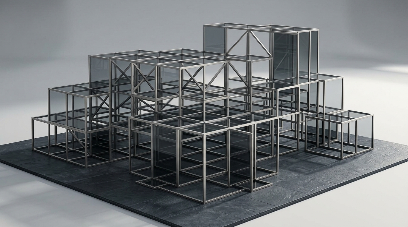
For years, web developers relied on fragile float hacks, table layouts, and heavy CSS grid frameworks (such as Bootstrap or Foundation) to build multi-column web pages.
Today, native CSS provides two comprehensive layout primitives: CSS Flexbox and CSS Grid.
Far from competing with one another, Flexbox and Grid are designed to work together in harmony. Choosing the right layout engine—and understanding modern intrinsic sizing algorithms—is the cornerstone of resilient, zero-JavaScript responsive frontend engineering.
The Fundamental Distinction: 1D vs. 2D
┌─────────────────────────────────────────────────────────────┐
│ 1. CSS Flexbox: ONE-DIMENSIONAL (Row OR Column)             │
│    - Content-driven sizing                                  │
│    - Ideal for toolbars, navbars, button groups, tag lists  │
├─────────────────────────────────────────────────────────────┤
│ 2. CSS Grid: TWO-DIMENSIONAL (Rows AND Columns)             │
│    - Container-driven coordinate space                      │
│    - Ideal for page scaffolding, card grids, complex forms  │
└─────────────────────────────────────────────────────────────┘
1. The Holy Grail of Responsive Grids: repeat(auto-fit, minmax(...))
With modern CSS Grid, you can build an infinitely responsive, auto-wrapping card grid without writing a single @media query:
.card-grid {
  display: grid;
  grid-template-columns: repeat(auto-fit, minmax(min(100%, 320px), 1fr));
  gap: 1.5rem;
}
How this mathematical one-liner works:
minmax(..., 1fr): Ensures each card expands equally to fill available horizontal row space.min(100%, 320px): Protects narrow mobile viewports (<320px) from overflowing horizontally.auto-fit: Automatically wraps cards to new rows and expands remaining items on the line seamlessly.
2. Flexbox for Content-Driven Micro-Layouts
While Grid establishes the outer layout scaffold, Flexbox handles internal component alignment:
.card-header {
  display: flex;
  align-items: center;
  justify-content: space-between;
  gap: 1rem;
}

.badge-group {
  display: flex;
  flex-wrap: wrap;
  gap: 0.5rem;
}
3. Decision Matrix: Flexbox or Grid?
| UI Component | Recommended Layout | Key Reason |
|---|---|---|
| Top Navigation Bar | Flexbox | Items flow in a single direction; space distributed around brand and links. |
| Product / Feature Grid | CSS Grid | Items must align strictly in both rows and columns. |
| Form Fields with Labels | CSS Grid | Aligns labels and inputs across multiple rows. |
| Media Player Controls | Flexbox | Sliders, play buttons, and volume widgets line up horizontally. |
| Full Page Dashboard Layout | CSS Grid | Scaffolds header, sidebar, main content, and footer. |
Next Steps
- Continue to the next guide: CSS Subgrid: Nested Grid Alignment & Card Layouts.